Documentation
Resumere - Creative Portfolio, CV, Resume HTML Template
Thank you so much for purchasing our item.
- Version: 1.0
- Author: Stillidea
- Created: 30 July, 2022
- Update: 30 July, 2022
Installation
Follow the steps below to setup your site template:
- Unzip the downloaded package and open the /HTML folder to find all the template files. You will need to upload these files to your hosting web server using FTP or localhost in order to use it on your website.
- Below is the folder structure and needs to be uploaded to your website or localhost root directory:
HTML/assets- Contains all of the assets referencedHTML/assets/styles- Stylesheet filesHTML/assets/images- Images filesHTML/assets/scripts- Javacript files
HTML/index.html- Homepage
- You should upload all or specific HTML files as per your need.
- You are good to go for adding your content now!
HTML Structure
Resumere follows a simple and easy to customize coding structure. Here is the sample for your reference:
The template is based on Bootstrap Framework
<!DOCTYPE html>
<html lang="en">
<head>

<!-- Your Title, Description, Stylesheets
============================================= -->

</head>

<body >

<!-- Theme Wrapper
=============================== -->
<div id="themeWrap">


  <header class="transparent">
   ......
  </header><!-- Header End -->


  <section>
    <div class="container"> ...... </div>
  </section><!-- section -->

  <section>
    <div class="container"> ...... </div>
  </section><!-- section -->

  <section>
    <div class="container"> ...... </div>
  </section><!-- section -->


  <footer>
    <div class="container"> ...... </div>
  </footer><!-- Footer-->

</div> <!-- Theme Wrapper  -->

<!-- JavaScript -->
</body>
</html>
If you need more information, please visit bootstrap site: https://getbootstrap.com
Color Schemes
You can change your Website's Color Scheme in an instant. There are as many possiblities of color scheme as much there are colors available. You just need to follow these simple steps and enjoy with your favorite colors.
Simply go to assets > styles folder and open style.css file and go to line #71 or find :root.
just change the color code against --theme-color property and save the file. That's all, refresh your website now with the new color scheme applied all over the website.
For Example:
/*=============== General Styling ===================*/
:root{
    --theme-color:#e63f49;
    --theme-dark: #312e2e;
    --theme-font-size: 13px;
    --theme-font-color: #8b8b8b;
    --theme-title-size: 20px;
    --theme-title-color: #181818;
    --theme-transition: all 0.2s linear;
}
Theme Customization
You can add a new file for Custom CSS in the styles folder so that you can better handle your Customizations for New Styles or
Overwriting Default Theme Styles. Simply, after creating a new file, for example:custom.css add all your Custom CSS Codes in the assets/styles/custom.css File and link it in the Document <head> after the assets/styles/style.css Linking. Also make sure that this is the Last Linked CSS File in the Document <head> so that your Custom CSS Styles are Overwritten properly.
<link rel="stylesheet" href="assets/styles/bootstrap.min.css" />
<link rel="stylesheet" href="assets/styles/fancyBox.min.css" />
<link rel="stylesheet" href="assets/styles/style.css" />

<!-- Here goes your custom.css
============================================= -->
<link rel="stylesheet" type="text/css" href="assets/css/custom.css" />

</head>
Logo Settings
The Logo Container can be found in the Header Container - <header>
            <div class="logo">
                <a href="index.html" title="Ever Care">
                    <img src="assets/images/logo1.png" alt="Ever Care">
                </a>
            </div>
Typography
Documentation and examples for typography, headings, body text, lists, and more.
Headings
| Heading | Example |
|---|---|
<h1></h1> |
h1. Heading |
<h2></h2> |
h2. Heading |
<h3></h3> |
h3. Heading |
<h4></h4> |
h4. Heading |
<h5></h5> |
h5. Heading |
<h6></h6> |
h6. Heading |
Inline Text elements
You can use the mark tag to highlight text.
This line of text is meant to be treated as deleted text.
This line of text is meant to be treated as no longer accurate.
This line of text is meant to be treated as an addition to the document.
This line of text will render as underlined
This line of text is meant to be treated as fine print.
This line rendered as bold text.
This line rendered as italicized text.
<p>You can use the mark tag to <mark>highlight</mark> text.</p>
<p><del>This line of text is meant to be treated as deleted text.</del></p>
<p><s>This line of text is meant to be treated as no longer accurate.</s></p>
<p><ins>This line of text is meant to be treated as an addition to the document.</ins></p>
<p><u>This line of text will render as underlined</u></p>
<p><small>This line of text is meant to be treated as fine print.</small></p>
<p><strong>This line rendered as bold text.</strong></p>
<p><em>This line rendered as italicized text.</em></p>
Code
Documentation and examples for displaying inline and multiline blocks of code
Inline code
Wrap inline snippets of code with <code>. Be sure to escape HTML angle brackets.
For example, <section> should be wrapped as inline.
For example, <code><section></code> should be wrapped as inline.Table
Documentation and examples for opt-in styling of tables.
Resumere is based on Bootstrap 4, so you can easily use Bootstrap's table classes to style your table. Bootstrap Documentation
Bordered
<table class="table table-bordered">
   .......
</table>| # | First | Last | Handle |
|---|---|---|---|
| 1 | Mark | Otto | @mdo |
| 2 | Jacob | Thornton | @fat |
| 3 | Larry | the Bird |
Striped
<table class="table table-bordered table-striped">
   .......
</table>| # | First | Last | Handle |
|---|---|---|---|
| 1 | Mark | Otto | @mdo |
| 2 | Jacob | Thornton | @fat |
| 3 | Larry | the Bird |
NoteYou can refer more information in Bootstrap Documentation here: Bootstrap Documentation
Icons
Line Awesome Icons icon sets are used in Resumere.
            <i class="las la-times"></i>
            <i class="las la-biking"></i>
            <i class="las la-music"></i>
            <i class="las la-camera"></i>
NotePlease go to their official documentation pages for a full list of icons: Line Awesome Icons
Image
Documentation and examples for opting images into responsive behavior and add lightweight styles to them—all via classes.
Responsive Images
Images in Bootstrap are made responsive with .img-fluid. max-width: 100%; and height: auto; are applied to the image so that it scales with the parent element.

<img src="assets/images/screenshot.jpg" class="img-fluid" alt="Responsive image">Image lightbox
Show image popup when click on image:
<a data-fancybox="gallery" href="assets/images/screenshot.jpg">
  <img src="assets/images/screenshot-thumb.jpg" class="img-fluid img-thumbnail" alt="image">
</a>
Image Lightbox with Link
Show image popup when click on link: Click Here for Popup Image
<a data-fancybox="gallery" href="assets/images/screenshot.jpg">Click Here for Popup Image</a>Video
Create responsive video embeds based on the width of the parent by creating an intrinsic ratio that scales on any device.
Embedded Video
Wrap any embed like an <iframe> in a parent element with .embed-responsive and an aspect ratio. The .embed-responsive-item isn’t strictly required, but we encourage it.
<div class="embed-responsive embed-responsive-16by9">
  <iframe class="embed-responsive-item" src="https://www.youtube.com/embed/7e90gBu4pas" allowfullscreen></iframe>
</div>NotePlease go to official bootstrap documentation for a full information of embed video: Bootstrap Documentation
Popup with Video
Show Youtube and Vimeo video popup when click on link:
<a class="popup-youtube" href="http://www.youtube.com/watch?v=7e90gBu4pas">Open Popup YouTube Video </a><a class="popup-vimeo" href="https://vimeo.com/45830194">Open Popup Vimeo video</a>Components
Setting up components is very easy. Here is the Some of shortcodes describe. also, EverCare is based on Bootstrap 4, so you can easily use Bootstrap's components: Bootstrap Documentation
Accordion
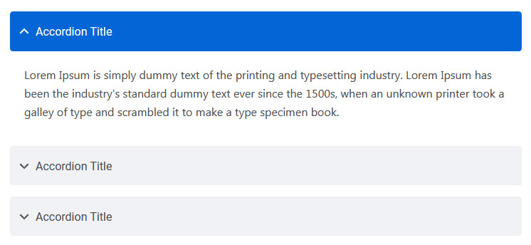
You can extend the default collapse behavior to create an accordion. To properly achieve the accordion style, be sure to use .accordion as a wrapper.
See below image and code for more information.
<div class="accordion" id="accordionDefault">
  <div class="card">
    <div class="card-header" id="headingOne">
      <h5 class="mb-0"> <a href="#" data-toggle="collapse" data-target="#collapseOne" aria-expanded="true" aria-controls="collapseOne">Accordion Title</a> </h5>
    </div>
    <div id="collapseOne" class="collapse show" aria-labelledby="headingOne" data-parent="#accordionDefault">
      <div class="card-body">This is Accordion Content</div>
    </div>
  </div>
  <div class="card">
    <div class="card-header" id="headingTwo">
      <h5 class="mb-0"> <a href="#" class="collapsed" data-toggle="collapse" data-target="#collapseTwo" aria-expanded="false" aria-controls="collapseTwo">Accordion Title</a> </h5>
    </div>
    <div id="collapseTwo" class="collapse" aria-labelledby="headingTwo" data-parent="#accordionDefault">
      <div class="card-body">This is Accordion Content</div>
    </div>
  </div>
  <div class="card">
    <div class="card-header" id="headingThree">
      <h5 class="mb-0"> <a href="#" class="collapsed" data-toggle="collapse" data-target="#collapseThree" aria-expanded="false" aria-controls="collapseThree">Accordion Title</a> </h5>
    </div>
    <div id="collapseThree" class="collapse" aria-labelledby="headingThree" data-parent="#accordionDefault">
      <div class="card-body">This is Accordion Content</div>
    </div>
  </div>
</div>
Options:
| Type Class | Features | Code Example |
|---|---|---|
.accordion-alternate |
Alternate Minimal Style for the accordions. | |
.arrow-right |
For set arrow in right side in accordions | |
Tabs
Default Bootstrap Nav component combined with iDocs for unique tabs.
See below image and code for more information.
<ul class="nav nav-tabs" id="myTab" role="tablist">
  <li class="nav-item" role="presentation">
    <a class="nav-link active" id="home-tab" data-toggle="tab" href="#home" role="tab" aria-controls="home" aria-selected="true">Home</a>
  </li>
  <li class="nav-item" role="presentation">
    <a class="nav-link" id="profile-tab" data-toggle="tab" href="#profile" role="tab" aria-controls="profile" aria-selected="false">Profile</a>
  </li>
  <li class="nav-item" role="presentation">
    <a class="nav-link" id="contact-tab" data-toggle="tab" href="#contact" role="tab" aria-controls="contact" aria-selected="false">Contact</a>
  </li>
</ul>
<div class="tab-content my-3" id="myTabContent">
  <div class="tab-pane fade show active" id="home" role="tabpanel" aria-labelledby="home-tab">This is Tab Content Home</div>
  <div class="tab-pane fade" id="profile" role="tabpanel" aria-labelledby="profile-tab">This is Tab Content Profile</div>
  <div class="tab-pane fade" id="contact" role="tabpanel" aria-labelledby="contact-tab">This is Tab Content Contact</div>
</div>
Options:
| Type Class | Features | Code Example |
|---|---|---|
Basic Navs |
Basic Navs Style for the Tabs | |
.nav-separator |
Basic Navs Style with Separator for the Tabs | |
.nav-tabs |
Tabs Navs Style for the Tabs. For example - above Preview Example. | |
.nav-pills |
Pills Navs Style for the Tabs | |
Helper Classes
We have created some really useful helper classes for you. Here are a few of them. also, You can refer other default bootstrap helper classes here: Bootstrap Documentation
Text Size:
.text-0- Changes the Font size to 11px..text-1- Changes the Font size to 12px..text-2- Changes the Font size to 14px..text-3- Changes the Font size to 16px..text-4- Changes the Font size to 18px..text-5- Changes the Font size to 21px..text-6- Changes the Font size to 24px..text-7- Changes the Font size to 28px..text-8- Changes the Font size to 32px..text-9- Changes the Font size to 36px..text-10- Changes the Font size to 40px..text-11- Changes the Font size to 44px..text-12- Changes the Font size to 48px..text-13- Changes the Font size to 52px..text-14- Changes the Font size to 56px..text-15- Changes the Font size to 60px..text-16- Changes the Font size to 64px..text-17- Changes the Font size to 72px..text-18- Changes the Font size to 80px..text-19- Changes the Font size to 84px..text-20- Changes the Font size to 92px.
Font Weight:
.font-weight-100- For font weight of 100..font-weight-200- For font weight of 200..font-weight-300- For font weight of 300..font-weight-400- For font weight of 400..font-weight-500- For font weight of 500..font-weight-600- For font weight of 600..font-weight-700- For font weight of 700..font-weight-800- For font weight of 800..font-weight-900- For font weight of 900.
Background Color:
.bg-transparent- For background color of transparent.bg-light- For background color of light gray.bg-light-1- For background color of more light gray.bg-light-2- For background color of more light gray.bg-light-3- For background color of more light gray.bg-light-4- For background color of more light gray.bg-dark- For background color of dark.bg-dark-1- For background color of dark gray.bg-dark-2- For background color of more dark gray.bg-dark-3- For background color of more dark gray.bg-dark-4- For background color of more dark gray
Box Shadow
.shadow-none- For No shadow to elements with box-shadow utilities..shadow-sm- For Small shadow to elements with box-shadow utilities..shadow- For Regular shadow to elements with box-shadow utilities..shadow-md- For medium light shadows to elements with box-shadow utilities..shadow-lg- For Larger shadows to elements with box-shadow utilities.
Opacity
.opacity-1- For 10% opacity..opacity-2- For 20% opacity..opacity-3- For 30% opacity..opacity-4- For 40% opacity..opacity-5- For 50% opacity..opacity-6- For 60% opacity..opacity-7- For 70% opacity..opacity-8- For 80% opacity..opacity-9- For 90% opacity.
Border Radius
.rounded-top-0- No Border Radius for top..rounded-bottom-0- No Border Radius for bottom..rounded-left-0- No Border Radius for left..rounded-right-0- No Border Radius for right.
Borders, Sizing, Spacing (margin & padding) and also much more....
Source & Credits
Fonts:
- Icons Font Face - https://icons8.com/line-awesome
Scripts:
- jQuery - http://www.jquery.com/
- Bootstrap 5 - http://getbootstrap.com/
- Slick Slider - https://kenwheeler.github.io/slick/
- Fancy Box - http://fancybox.net/
Support
We are located in GMT +5:00 time zone and we answer all questions within 12-24 hours in weekdays. In some rare cases the waiting time can be to 48 hours. (except holiday seasons which might take longer).
Don’t forget to Rate this template
Thank You.
Changelog
See what's new added, changed, fixed, improved or updated in the latest versions.
Version 1.0 (30 July, 2022)
Initial Release


